HADYN
AI generated writing assistant for writers, bloggers, journalists and every day people
The problem: the current interface is not ready for launch and users need a user-friendly interface to assist them in writing
The goal: apply color, white space, iconography and typography to change mid-fidelity wireframes provided by the client to high-fidelity
My role: UI Designer
Discovery
I created a usability test plan to better understand user expectations and identify areas of improvement in my design.
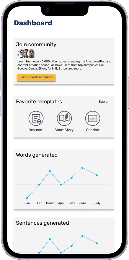
Beginning with the mid-fidelity wireframes I was provided with from the client, I applied type, iconography and color meaningfully based on the style guide to design a high-fidelity prototype.
Using my high-fidelity prototype, I conducted user testing where I measured the success of different task scenarios qualitatively and quantitatively. I followed this with a usability test report to conclude my findings.
Mid-fidelity
High-fidelity
Mid-fidelity
High-fidelity
Solutions
Color
I applied color thoughtfully to indicate the functionality of elements to users.
Drop shadows
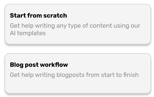
To create a three dimensional effect, I added drop shadows over certain elements that indicates to users it is clickable.
Iconography
I added icons throughout the interface to create meaning and to guide users.
Key takeaways
Protoyping in Figma
As this was my first high-fidelity prototype, I learned how to prototype in Figma, create hotspots and connect frames.
Iconography
I used Google’s Material Symbols iconography in my designs to convey meaning to users.
Applying color
I learned where to apply color in a frame. For example, applying color to an icon in the bottom navigation indicates to a user that the tab is clicked.
Next steps
Build out more frames for the mobile app to make it completely functional.
Implement actionable recommendations.
Add more color.
Design a tablet version of the app.


